Enabling Category Management with Space-Time Intelligence
on October 13th, 2007 at 4:38 amBy Nicholas Jacquez , TerraSeer
Category management is the process of identifying and managing product categories as strategic business units, rather than simply viewing a retailer’s offering as a collection of individual products. The category management approach delivers enhanced business results by focusing on delivering consumer value. It is often a shared process between a retailer and its vendors. This description comes from Category Killers (2005) by Robert Spector:
For the past couple of years, the term “category management” has entered the retail lexicon in virtually every merchandise category. Category management began in the supermarket business, where big retailers of packaged goods learned that they could improve sales and profits if they could more efficiently administer all their different product classifications. The idea was to oversee the store not as an aggregation of products, but rather as an amalgam of categories, with each category unique in how it is priced and how it is expected to perform over time.
One vendor is designated as “category captain” and charged with helping the retailer define the category; determine its place within the store; evaluate its performance by setting goals; identify the target consumer; divine the best way to merchandise, stock, and display the category; and then influence the implementation of the plan. Becoming a captain is obviously an important position because it offers that supplier an opportunity to sway a retailer’s buying decisions.
This article introduces the concept of “space-time intelligence” as a basis for building excellence in category management and provides an overview to a three-tier approach for building a space-time intelligence-enabled management process. It will also provide detail in an example of the essential first tier: visualization and analysis to drive understanding of store level transaction data. (Author’s note: Two more articles are planned on this topic, which will expand the discussion of steps 2 and 3 in the process, including examples of demographic and market landscape predictive analytics.)
Space-Time Intelligence
Among other measures, retailers need to look at sales and traffic counts by store, by region and by time period. Restaurateurs and convenience retailers talk about “dayparts”; radio programming and outdoor advertising placements are designed to catch the morning and evening “drivetimes.” In government, census data are gathered periodically and analyzed to reveal trends over time and geography. Time, from season of the year to time of day, is an essential component in understanding the context that drives real world phenomena, from demographic trends to retail business results.
Unfortunately, the tools we use to visualize and analyze marketplace data do not deal with time in a fluid and graphic manner. GISs are designed for the visualization of spatial data and are not well suited for space-time data. For example, if you want to look at data over multiple time periods in a GIS, you generate individual maps for each time frame (even of the same geography) and look at each separately; or go outside the GIS to build a “flip chart” using Microsoft PowerPoint or a .gif “animator” to view them in sequence. The business world, however, is dynamic. Consumer purchases occur at various points in geographic space and time, captured at the store register as POS (point of sale) data. GIS maps and standard spreadsheet-style analysis tools are static, so they cannot easily reflect the dynamic nature of retail data.
The answer to the problem of GIS not incorporating time is to develop a new type of information system. The TerraSeer Space-Time Intelligence System, or STIS, is an analysis platform developed specifically to address this need. STIS is not a GIS, nor is it based on GIS technology – it is a proprietary technology in which time is native to the data structure, creating a spatiotemporal (space-time) data construct. As a result, we can represent and analyze a dynamic marketplace with a tool that is similarly dynamic. In addition to its space-time data structure for animated data visualizations, STIS links multiple data views (maps, graphs, tables, etc.) so that features highlighted in one view are simultaneously highlighted in all others, allowing intuitive data exploration.
The implications for business decision making are clear. Maximizing value delivery to consumers is the key to category management and that depends first on in-depth understanding of how product and category purchases occur at store level, through time, and the relationships between those purchase patterns and the dynamic consumer and competitive landscape.
A Three Step Process
In our work with manufacturers, we focus first on the level of data that is most difficult to see and analyze using current GIS and BI solutions, store level transactions as they change and grow through time. Once we visualize and understand store level transactions, higher levels of predictive analytics are added in levels 2 and 3.
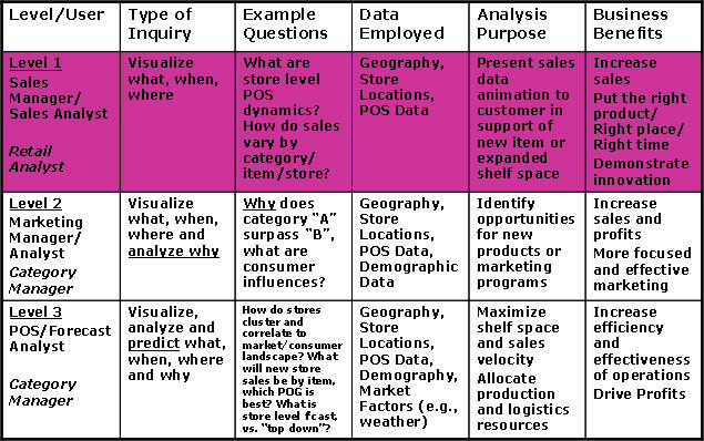
Table 1 below shows the three-level concept as applied to a manufacturer of consumer durables. The table shows typical users at each level, the types of inquiries they make, example questions, data required, purpose of analysis outputs, and benefits to be derived.
Note that while user types, analysis purpose and benefit statements are presented from a manufacturer’s viewpoint, they coincide directly with retailer category management objectives as expressed in this article’s introduction.
 |
Level 1 in Greater Detail – Visualizing What, When and Where
In the following example analysis, we focus on five products that a retailer has said it wants to discontinue. Since the retailer made this decision just prior to the beginning of the key season for this product category, the manufacturer has already loaded its warehouse with product from China that can not be returned. If the retailer refuses to take this warehoused product, the manufacturer will be sitting on $400,000 worth of inventory. Selling to other retailers is possible but not probable, as this retailer is the largest customer for the category of products represented. However, the retailer has agreed to consider options for liquidating the inventory. TerraSeer’s proposal to the manufacturer is to use visualization and analysis of store level data to find the “80/20” rule; the 20% of stores that comprise 80% of the sales for these items. We can then place specially priced in-aisle display shippers of the five items in those high volume stores, yielding the shelf space to higher velocity items. This will satisfying the retailer’s shelf productivity objectives, deliver value to consumers across the store spectrum and solve the manufacturer’s $400K inventory problem, all by putting the right products in the right place at the right time.
The animated screen capture (3 MB .wmv file) shows an analysis of the five items in question in California stores over the past several years. We begin with a simple map of California at screen left, showing stores as squares of various sizes. As sales of “Item E” grow month to month, the squares get darker and larger in size. Two Scatter Plots showing Monthly Sales of Item E vs Total Store Sales and Category Sales vs Total Store Sales are shown at top right, allowing the user to understand sales behavior of the individual item relative to the category as a whole. A Data Table and Box Plot are shown below. We animate the sales sequence by clicking the “Play” button at top center. On the map, it is easy to see the stores where item E does well, as sales change month to month. It is clear, especially as we zoom into the map, that there are a number of stores where this item never sold well and others that did the majority of Item E volume. We stop the animation and highlight the top stores by “brushing” the Box Plot. The top stores are highlighted in all views and several clicks on the data table easily select the stores for fulfillment activity.
Next we scroll to the right to see an analysis of the other four items. These are arranged with a Map and Histogram for each of Items A through D set up at the corners, surrounding a Product Mix Plot at screen center. Again we animate the monthly sales data by clicking the play button and can quickly see the store level sales dynamics through time. The Product Mix Chart and/or Histograms can be brushed at any point in time to identify the target stores for each item. Finally, we see a Seasonality Plot that shows the level of sales month by month for each store.